The following is a guest article from Rose Morrison of Renovated. Submit your own article or building project to be featured on the Swatchbox Blog.
How often do you consider how color impacts our lives? It’s probably not something most people think about every day, but color influences how we feel and act. If you’re a designer, you can use specific shades to make your spaces convey certain emotions — and that’s a powerful ability.
Here’s a look at how color theory can impact workers’ productivity.
What’s the Psychology Behind Color?
Colors come in various shades and hues and play a significant role in our lives. They have the power to impact what we buy, the way we live, and even how we feel.
Communities around the world have used color to imply different messages for centuries. While people in Western countries typically view black as a mourning color, individuals in China usually wear white to funerals. That’s only one example that points to how cultures worldwide use colors as symbols.
Feelings about a specific color depend on upbringing, values, and location. Because they represent different meanings, we can equate many emotions and reactions to particular tones. That’s why your favorite color might be orange, but your best friend prefers pink.
These connotations point to why you might buy from one brand over another, as well. Companies like Coca-Cola choose red for their product labels for a reason. That color evokes boldness and energy — and consumers drink Coke for the fun, exciting flavor.
If you think about the cultural and social meanings behind color, you can conclude that it just might have the power to influence our moods, as well.
How Does Color Impact Mood?
Researchers have made observations about how colors can impact our moods over the past few decades. Their findings show that people often exaggerate how much they can affect someone’s state of mind, so you might only experience a brief change. Because your emotions about a particular color can be subjective, you may not undergo the same effect as others, either.
Still, experts have linked colors and moods in various cases. It turns out they can increase a space’s functionality, which means designers and architects should carefully consider the colors they choose when they work on specific projects. Their decisions can determine the building’s look and feel as a whole.
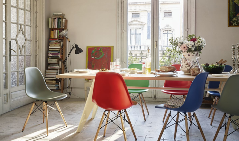
Image Source: Maxima
How does color influence mood? It stems from psychology — and some connotations are more universal than others. While someone from an Eastern country might wear white in mourning, they can appreciate the fact that it also alludes to purity, simplicity and cleanliness. That’s one reason why you’ll find that many hospitals around the world feature white walls and accents.
Though you may not always be able to influence someone’s mood with particular colors due to the differences in perception, you can typically make a room feel a certain way through the shades you use. That’s crucial for businesses, as they can use colors to increase productivity, encourage shopping and more.
Different Colors and Their Respective Effects
There are endless ways to interpret colors — and, as a result, you can use different shades and hues to change how people perceive your space. If you have to paint a closet, your best bet would be to use light tones to make the area feel more spacious. Keep in mind that a color’s shades and hues matter, too, as a bright orange would feel bolder than a pastel.
Let’s take a closer look at the meanings behind the most basic colors.
Red
If you think about a color that would equate to danger or warning, you’d probably think red, especially since stop signs, traffic lights, and police sirens are this shade. Additionally, it can be used to describe anger, as we often say that people “see red” when they’re mad. These feelings are inherently negative, but they can also be exciting or adrenaline-inducing.
That said, people often see red as a romantic color, as well. It turns out that men consider women who wear red more attractive. It’s used prominently on Valentine’s Day to convey that exact emotion.
Orange
Similar to red, orange tends to grab your attention. It’s energetic and fun — but not as intense as red, which makes it a smart in-between choice. If you want someone to feel happy and enthusiastic, you might pick orange to convey your message.
Yellow
This color tends to be more subdued than red and orange. While yellow can be vibrant and dynamic, you can also feel joyful and pleasant when you see its various shades and hues. If you make it harsher, you can experience negative emotions like frustration.
Pink
Pink rarely has adverse effects on people. It’s calm, nurturing, and feminine, which makes individuals feel at ease. If you’re a creative person, you might find that the color inspires you in your endeavors.
Green
There are numerous applications for the color green. While earthy, deep greens can help people feel more grounded and at peace, lime greens will make you feel active. It’s an optimistic color, as well.
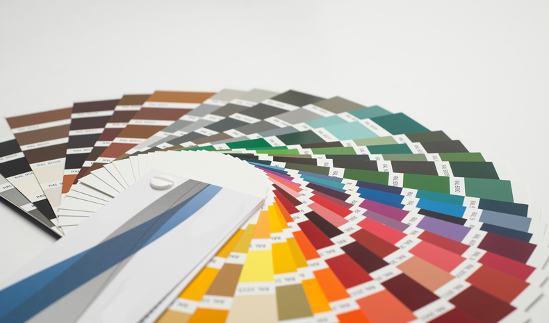
Image Source: Dorn Color
Blue
Blue tends to be an intense color. Darker shades are traditionally more masculine, which means you might feel powerful when you see the color. That said, lighter tones can be a way to convey harmony and balance.
Purple
This color has long been associated with royalty, so you might interpret wisdom, bravery, and success from purple rooms and objects.
White
Usually, white points to innocence, purity, and sterility. There’s a reason why many brides in Western countries wear white to their weddings. However, it can seem too cold and stiff in cases where that’s the only color.
Black
Black can be sad and isolated. It’s mainly associated with negativity, especially regarding death. Still, people often wear the color to convey professionalism and seriousness. Black tends to be a highly sophisticated color in the right circumstances.
Ways to Incorporate Color Into Workspaces
Those in the design space can use color to transform their projects. That’s especially true with commercial properties like offices. Rather than make employees feel overly energetic or even disparaged, you want them to be cool, calm, and collected as they tackle their work.
It’s generally a smart idea to start with paint. While neutral colors are a straightforward option for reception areas, you may want to be a bit bolder where employees work. If you come up with a selection that involves a few related colors, you can design a space that feels perfect for the office.
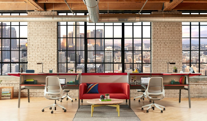
Image Source: Turnstone
Generally, blues and yellows are inspirational and motivating colors. They can help people feel productive and collaborative while at work. If you plan to paint the area, you might want to pick lighter shades so your choice doesn’t seem overly bold.
Feel free to explore accents, as well. If you want to use red or yellow as a statement color to catch employees’ attention, you’d probably be better off with an accent wall rather than a red room. A subtler choice, like orange pens or stationery to give workers a boost, can help, too.
Be sure to avoid discouraging colors like black and gray. It’s much better to pick vibrant shades that encourage employees to feel excited about their workdays. While you should stay away from neon and other overly bright colors unless they work for the brand, you can use many different tones to boost productivity.
Help Inspire Workers With the Power of Color
There are endless ways to interpret color — and they all depend on your personal experience. However, no matter your background, almost everyone agrees that some shades have universal meanings. As a designer, you can use the connotations to your advantage, especially in workspaces. From bold reds to tranquil blues, you can create areas that encourage employees to do their best.
--
Rose Morrison
Rose Morrison is a construction and design blogger and the managing editor for Renovated. To read more posts by Rose, check out her blog.


Comments