What is an interior colour scheme without a little dash of drama?
You want your project to be an interesting, impactful place to exist. Dark colours are the ideal way to add that all-important touch of compelling drama. Dramatic interiors add the wow factor to any project, and it’s easier than you might think to implement them, no matter what size project you’re styling.
The Benefits of Darker Colours
There are several reasons to choose a darker colour scheme, starting with the fact that it adds atmosphere and creates a cosy mood in your project. Dark colours are enveloping and cocooning, making any room feel instantly more inviting. Dark colour schemes are also great for hiding any imperfections in your project, such as uneven walls.
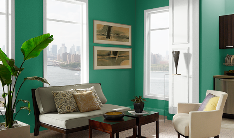
Image source: BEHR
Deep, rich colours such as navy, emerald green, charcoal and aubergine are perfect backdrops to art and decor, making every colour you place in front of them pop. And, despite the consensus that dark colours can only be used in large spaces, these colour schemes work brilliantly in smaller projects when you embrace tinier areas and lean into the dramatic nature of deep shades.
It’s also a way to work with what’s already present in your project. If you have an older property, for example, that has darker wood tones on the floors, cabinetry and trim, darker colours can work well to embrace that colour scheme and bring out the natural beauty of the wood. You can then pair these darker rooms with pastel furniture or neutral textiles that can add brightness to the space.
Here are some tips for creating a striking impact in your project with darker hues.
Limit Dark Colours to One Feature
If you’re scared off by the idea of decorating an entire room in dark colours, why not choose a feature and transform that into a darker shade instead? Maybe you choose a feature wall for a splash of colour, keeping everything else neutral to balance out the dark with the light.
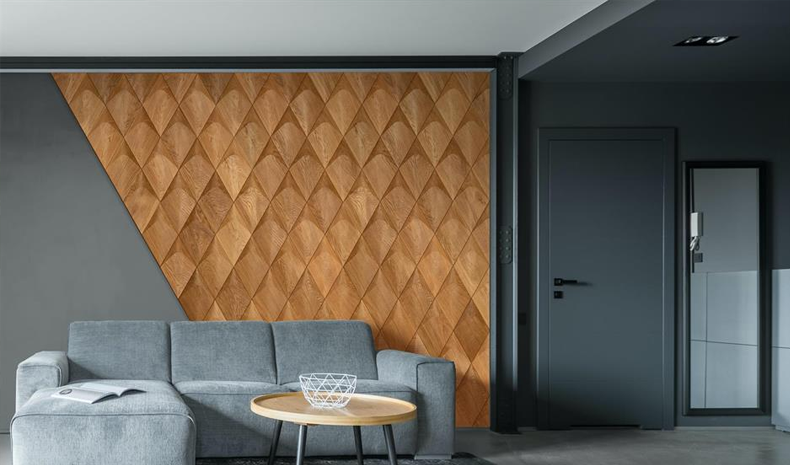
Image source: lovePROPERTY
Or perhaps you choose a functional element of the project to go darker. For example, blinds and curtains are the perfect way to add colour or pattern to a space in a more subtle way. Concealed blinds can be hidden away until you want them on show, where you can then bring in those deeper hues for a touch of drama, especially for larger windows. In the kitchen, worktops and cabinets can be an effective way to add depth and character, especially when paired with a paler colour on the walls.
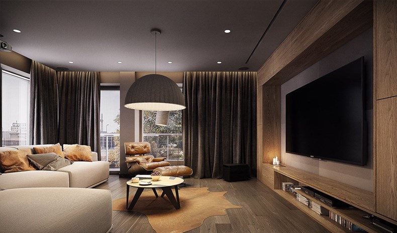
Add Atmosphere with Earthy Colours
If you love to create a sense of occasion, earth tones like browns are making a comeback and are a wonderful addition to any property, particularly for living rooms and dining rooms where you’re likely to entertain. When paired with dark woods like mahogany and walnut, rich velvety colours couple beautifully with the warm glow of low lighting for an elegant and luxurious colour scheme that makes for a very cosy space.
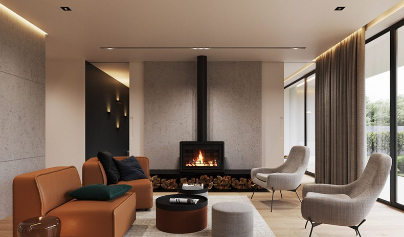
Image source: Spotools Interior Design Publishing
Why not go extremely bold and really embrace the cocooning effect that these velvet colours provide by painting the walls, trims and ceiling all the same colour? It’s a tip that Abigail Ahern, an expert in moody interiors, recommends when using dark colours and one she’s even implemented in her own home.
Contrast Textures
You aren’t limited to dark colours on the walls. In fact, mixing textures in various deep shades can be a great way to play with this trend, adding drama and interest without it feeling overwhelming. For example, maybe you add a plush rug in a deep red over your floorboards, black throws over your leather couch or statement metal light shades to add a moodier tint to your lighting.
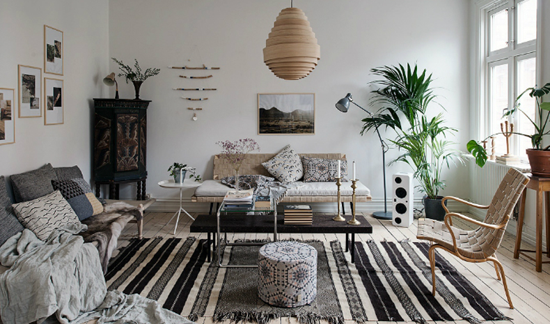
Image source: The Interior Editor
Textures shouldn’t be overlooked when you’re creating a colour scheme, as they’re the elements that add depth to a room and make it more inviting. If you only stick to colours on the walls, you’re missing a huge opportunity to enhance your colour scheme and bring in features that add that wow factor.
Lean Into a Theme
If you’re not sure where to start with dramatic interiors and bolder colours, why not choose a theme to help guide your colour palette? For example, Art Deco is a theme that utilizes darker, bolder colours and geometric patterns, and can make for impactful decor in a space. Black and gold, chrome and polished woods are commonly used in Art Decor palettes, with chevron and zigzag patterns.
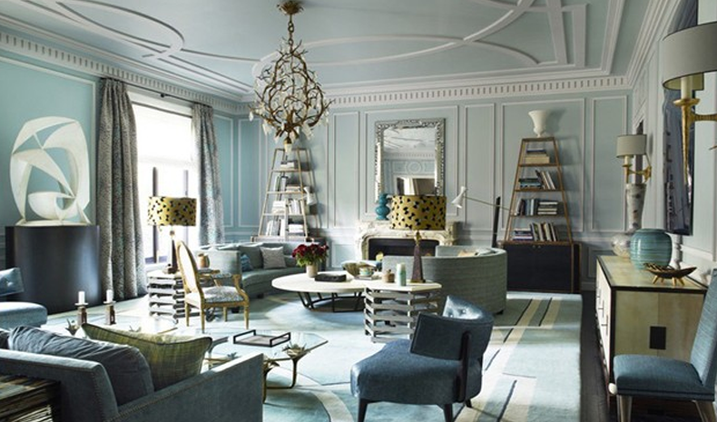
Image source: decoraid
Or maybe you want something more traditional. Older properties can work well with Victorian themes, with purples, greens and peacock blues that have an opulent feel to them and make any room feel instantly more cosy and welcoming. Think about the period of your project, your personal style and the items of furniture you already have to choose a theme that works well.
Darker colours may seem more subdued in theory, but when you put them into practice, they have the potential to be every bit as dramatic and exciting as bright shades. It can help to ground a room, create an enveloping feel or help you make the most of a smaller space to create a cocooning vibe that smaller spaces lend themselves well to.
--
Annie Button
Annie Button is an advertising and design blogger. To read more posts by Annie, check out her blog.
![]() Swatchbox is a premier sample fulfillment service that connects design professionals with building product manufacturers. With proprietary software designed by insiders of the design community, Swatchbox helps manufacturers improve product sales and brand affinity by delivering material samples to the design community with speed, intelligence, and style. Learn more and join Swatchbox at www.swatchbox.com.
Swatchbox is a premier sample fulfillment service that connects design professionals with building product manufacturers. With proprietary software designed by insiders of the design community, Swatchbox helps manufacturers improve product sales and brand affinity by delivering material samples to the design community with speed, intelligence, and style. Learn more and join Swatchbox at www.swatchbox.com.

Comments