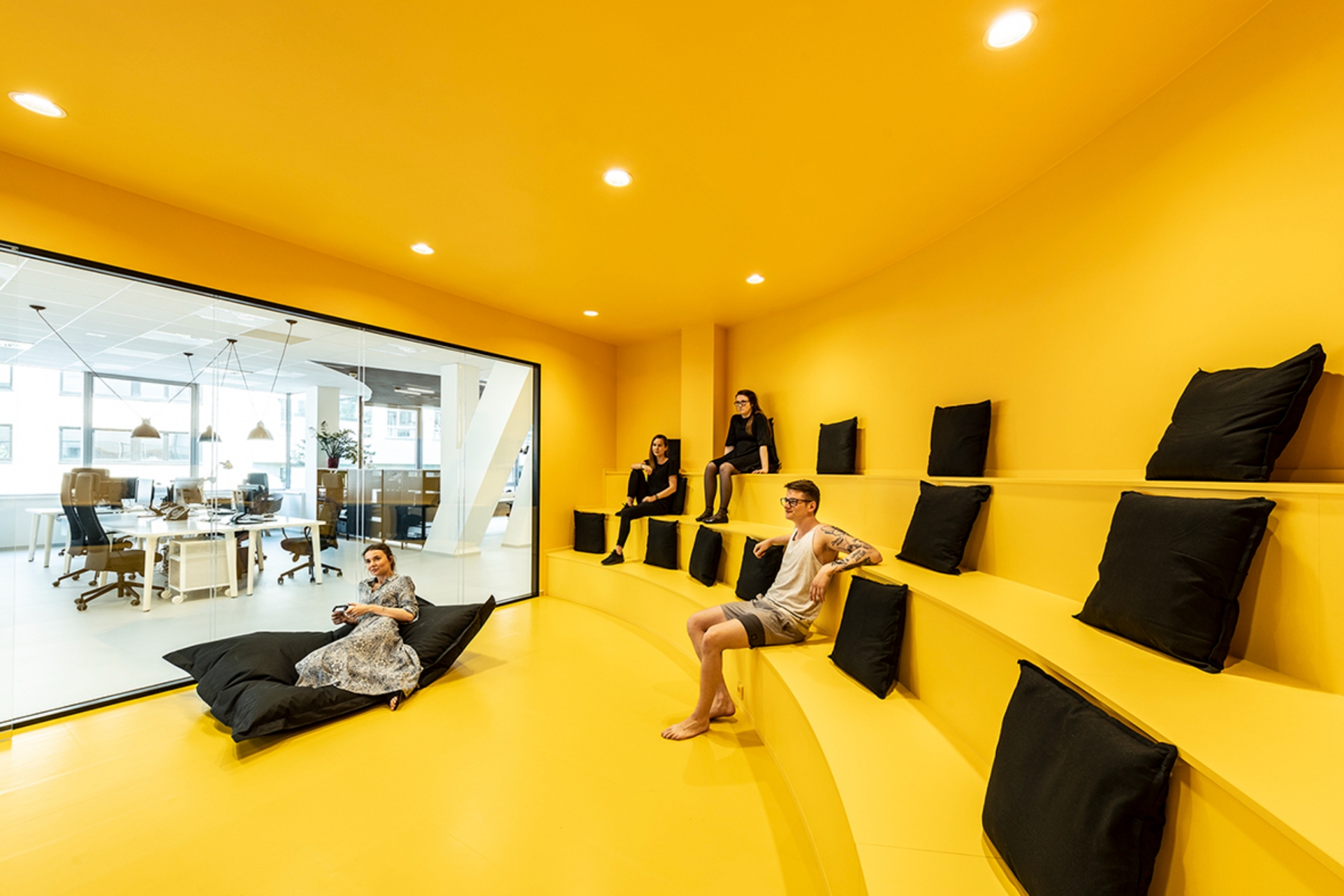
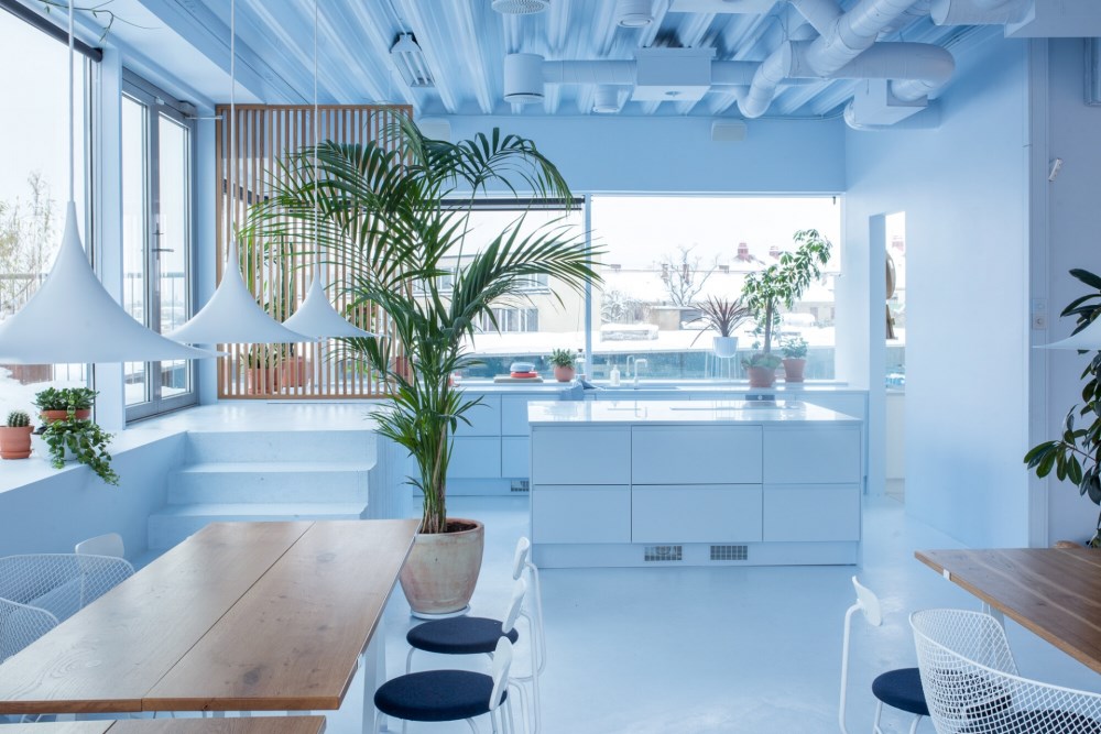
Color drenching is a design trend in which every visible surface in a room, such as walls, ceilings, trim, doors, and sometimes even furnishings, is painted in the same hue. This creates a room that feels immersive because you are literally surrounded by one color. While color drenching has historically been used as a painting technique to hide undesirable fixtures, the term itself began appearing more frequently in media around 2022. By 2023, color drenching was being called out by interior trend forecasters as one of the year’s key design directions. Interest surged further in early 2024, when Google Trends showed a steady uptake of people searching for the term. Color drenching once again showed up in 2025 trend forecasts, proving it hasn't been forgotten yet.
 DDB Prague Office by B2 Architecture - Image Credit: Alexander Dobrovodský
Smart Ways to Use Color Drenching
Color drenching performs best in small, contained environments such as powder rooms, entryways, reading nooks, or boutique hospitality lounges. In these contexts the immersive effect feels intentional and dramatic rather than oppressive. Color drenching is also highly effective in retail environments, where the goal is often to create a strong emotional impact and brand association in a short amount of time. Immersive, color-saturated interiors can draw shoppers in, reinforce visual branding, and enhance product presentation by framing items within a unified, high-impact backdrop.
 Bala Pop Up Shop by Ringo Studio - Image Credit: Anna Morgowicz
There are several situations when color drenching is likely to backfire. In large open plan homes, an all over hue may feel monotonous and challenging to live with every day. The intensity of a single color across broad surfaces can produce “color fatigue,” especially when that color is bold or saturated. Bathrooms and other dimly lit spaces are often poor candidates. Color drenching in such areas can create a heavy, almost clinical atmosphere. Additionally, heritage or historical rooms with decorative moldings may suffer when architectural details disappear under a uniform paint palette. Without contrasting textures, varying finishes and well–considered accents, an all one color approach falls flat.
Creating Depth Through Materiality
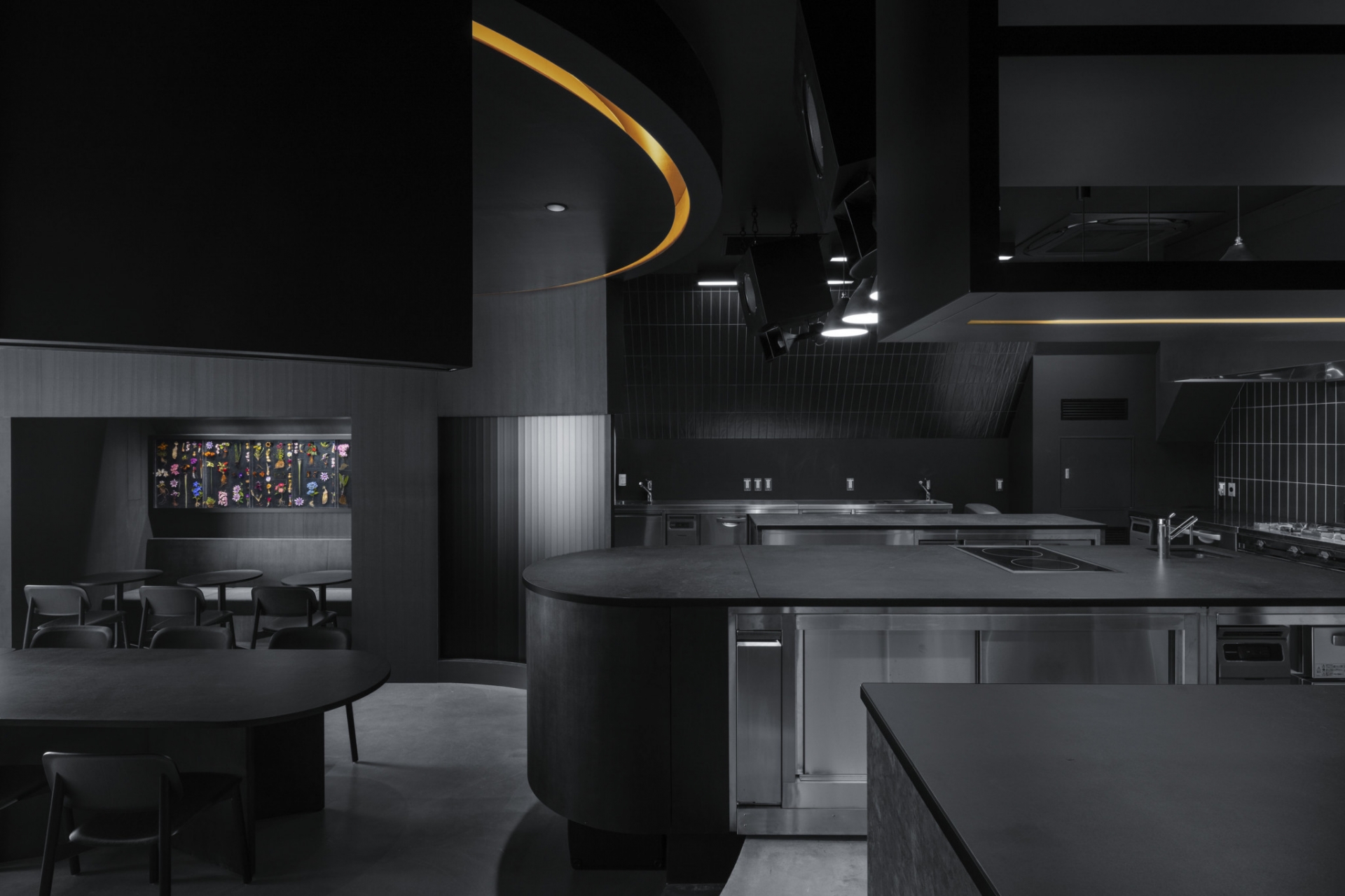
In monochromatic interiors, the choice of material becomes more critical than ever. When color is no longer the primary tool for contrast, designers have to rely on other sensory elements to create interest and depth. Surfaces that absorb or reflect light differently can shift the mood of a space without deviating from the selected hue. For instance, velvet upholstery can soften a room where the walls and ceilings are finished in a high-sheen paint, while natural materials like wood, stone, or woven textiles introduce subtle variation and tactility. These contrasts can be especially effective in preventing a space from feeling sterile or one-dimensional.
 Tokyo Burnside by Snøhetta - Image Credit: https://snohetta.com
Materiality also plays a key role in grounding the overall tone. A single color rendered in matte tile will have a very different presence than that same color in polished plaster or powder-coated metal. These shifts are often subtle but make a significant difference in how the space feels and functions. By carefully selecting materials that complement each other within the same color family, designers can achieve a sense of cohesion while still giving the eye something to explore. Sampling these materials in advance allows for more confident decision-making and helps ensure that the finished result feels layered and complete rather than visually flat.
Color drenching can be a gratifying design experiment if approached thoughtfully. Use it judiciously in small or occasional use spaces to enjoy the immersive drama without long term fatigue. For full time living areas, more flexible strategies such as accent walls or tonal schemes tend to offer lasting appeal. This trend may be here now, but like most bold visual statements, it may well fade over time.
 Swatchbox is a premier sample fulfillment service for building product manufacturers. With proprietary software designed by insiders of the design community, Swatchbox helps manufacturers improve product sales and brand affinity by delivering material samples to the design community with speed, intelligence, and style. Learn more and join Swatchbox at www.swatchbox.com.


Comments