

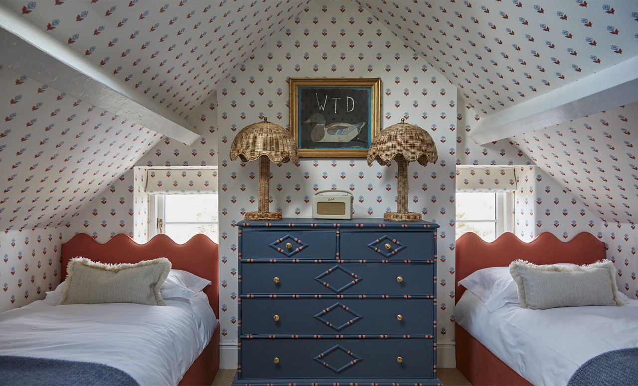
Most material decisions in a residential interior are relatively forgiving. Wallpaper is less so, which is part of what makes it interesting. A pattern that reads beautifully on a sample card can feel overwhelming across four walls. A color that seemed bold in a showroom can flatten entirely in a room with limited natural light. UK-based interior designer Naomi Wheeler, whose move from commercial to residential interiors shifted her relationship with wallpaper considerably, has learned to work with these variables rather than around them.
In commercial design, durability and broad appeal tend to pull specification toward the cautious end of the spectrum. Residential work removes some of those constraints and introduces different ones: the opportunity to respond to an individual's personality, the character of a house, and the kind of choices that would never survive a commercial brief. "Residential design feels much more personal," she says. "Wallpaper gives you so much opportunity to do that."
Starting With Wallpaper
Naomi's starting point with wallpaper is earlier in the process than most clients assume. "It can really help establish the direction of a room," she says. "You can pull colors from it, think about the textures that sit alongside it and then build the furniture and accessories around that." In this model, the wallpaper is not chosen to complement a scheme already in progress. It generates one, giving every subsequent decision a reference point and a reason.
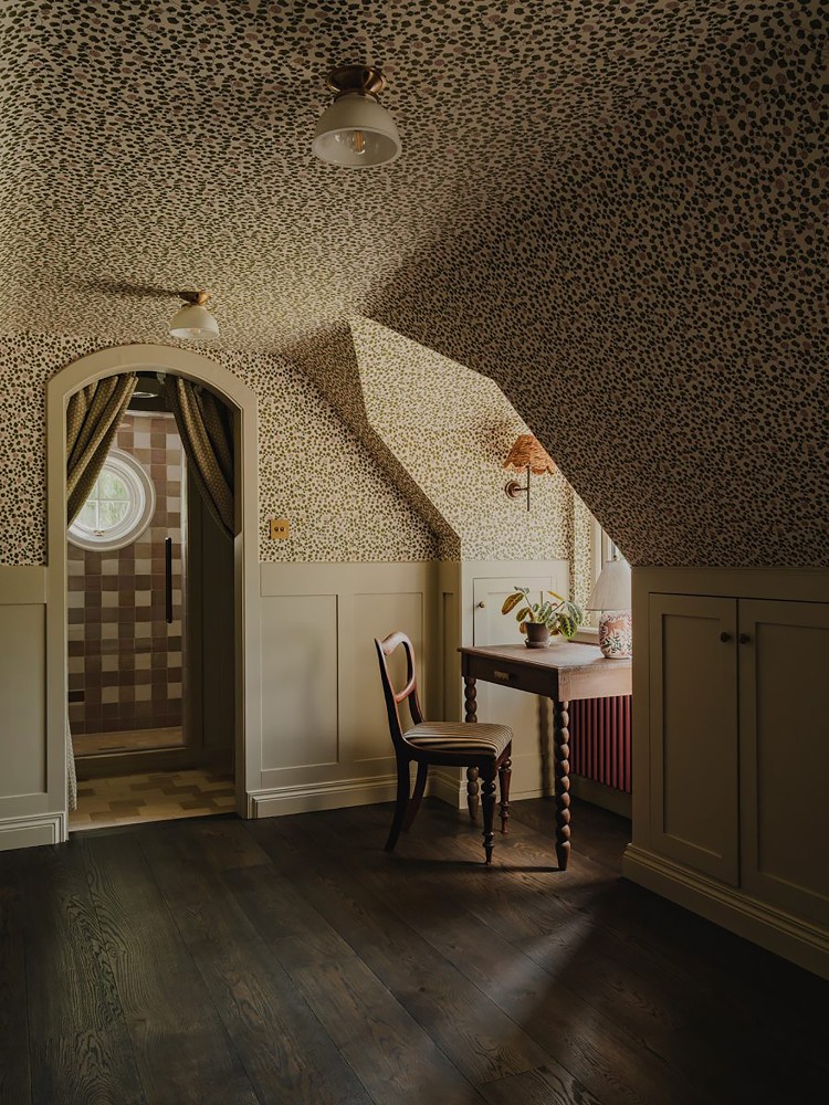
Buckinghamshire Guesthouse by House Nine and Chaunceys - Image Credit: Joey Kendal Brown
The color system that a well-chosen wallpaper provides is one of its most underused qualities. Rather than treating the pattern's dominant tones as the palette to build from, Naomi works with the quieter ones. "I might pick out a much quieter color from the wallpaper for the joinery, another for the upholstery, and then introduce a slightly contrasting tone elsewhere," she says. "It gives you a really nice starting point for building a layered scheme." The room ends up feeling cohesive without feeling obvious, with the wallpaper's influence running through it without being labored.
This is also where wallpaper and paint part ways as color decisions. Paint creates a backdrop. Wallpaper creates a system. "With paint, you're creating an overall backdrop as a solid color, whereas with wallpaper you're often choosing a whole color palette," Naomi explains. "I'm looking at how the different colors within the pattern relate to each other, and then how I can pull those colors out into the rest of the room."
Small Spaces
One of the more persistent assumptions about wallpaper is that small rooms require restraint, that a bold pattern will close in a compact space and make it feel even smaller. Naomi has found the opposite to be true. "Some of the best wallpapered spaces I've seen are actually the smaller ones, because you can make them feel really immersive and special." The cocooning quality that an enveloping wallpaper creates in a compact room is something a larger space cannot replicate, and Naomi actively pursues it: "Sometimes I'll deliberately make a small room feel smaller and more enveloping. A beautiful, rich wallpaper can create that cocooning feeling, and I think that's much more interesting than always trying to make a room look larger than it is."
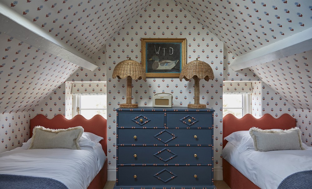
Wood Farm House by Millie Turner Designs - Image Credit: www.millieturnerdesigns.com
The small powder room, the narrow hallway, the downstairs bathroom: these are the rooms where wallpaper tends to have its greatest impact, and also the ones where clients are most reluctant to commit. "A small cloakroom or downstairs bathroom is a great opportunity to do something you might not be brave enough to do in a larger space."
Pattern as Architecture
Beyond color and texture, pattern gives a designer a direct way to influence the proportions and atmosphere of a room. "A vertical pattern naturally draws your eye upwards and can emphasize height, whereas something more horizontal can make a room feel wider," she says, but she also adds a caveat: "I don't think you should follow those rules too literally. I'd always look at the room as a whole and think about what I actually want to emphasize." The principles are useful starting points, but they are not substitutes for reading the specific room in front of you.
The most technically demanding aspect of pattern is how it behaves around interruptions: windows, doors, alcoves, chimney breasts. Naomi's approach is to plan from the elevations before specifying, working out where the repeat will land around every obstructed wall before a roll has been ordered. "Before specifying, I'd look at all of the elevations and consider where the pattern is going to land around windows and anywhere with tricky cuts," she says.
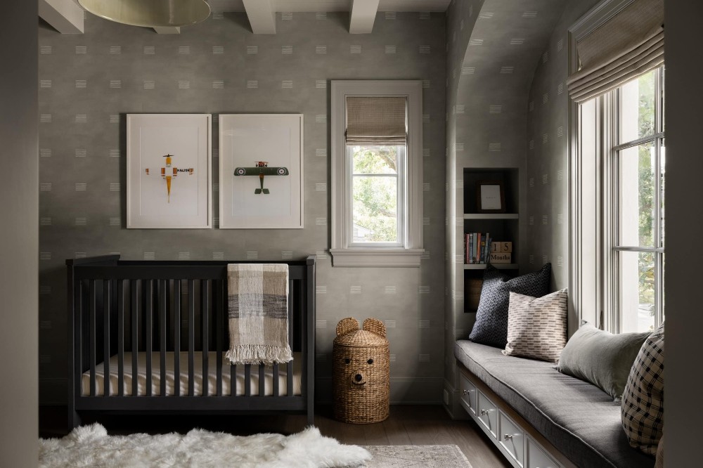
The Houston Estate by Studio McGee - Image Credit: Lucy Call
In rooms with multiple interruptions, the pattern will inevitably compromise somewhere, and the decision about where that compromise falls is better made at the planning stage than discovered during installation. Perfection across every wall is rarely achievable, so the smarter goal is to prioritize the sightlines that matter most, such as the view from the doorway or the wall that draws the eye when you first enter the room.
Bold Choices
The risk with a bold wallpaper is rarely that it is too much on its own terms. The problem tends to be what surrounds it. Naomi explains her strategy: "If you're using a large scale pattern, I'd let that be the main focal point and then balance it with quieter textures and simpler forms elsewhere."
That does not mean eliminating pattern from the rest of the room. "I actually love mixing patterns, but I want there to be a hierarchy in terms of what your eye is drawn to first. If everything is trying to be the statement, nothing really becomes the statement." The wallpaper earns its boldness when the things around it understand their role and play it well.
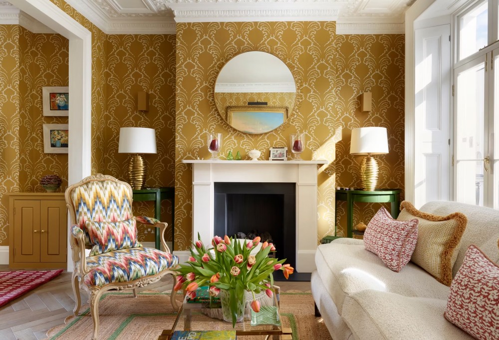
Chelsea Townhouse by Yellow London - Image Credit: www.yellowlondon.com
This hierarchy extends to how Naomi handles clients who fall in love with a pattern that is wrong for their space. Her first move is to understand the attachment rather than challenge it: "I'd first ask them what they love about it. If a client has really connected with something, I think it's important not to dismiss that. Maybe it's the color, the pattern, or even just the atmosphere it creates."
Most often, she finds that the client has seen the wallpaper in someone else's project and connected with it in that context, which does not automatically make it right for theirs. From there, the conversation becomes one of translation: identifying the quality the client responded to and finding a way to deliver it more appropriately. "I'd try to understand whether we can use that quality somewhere else, or find a similar design that's better suited to their space."
But Naomi is clear that steering clients toward a safer choice is not always the right outcome. "Sometimes I'll encourage them to go for it. I don't think designers should always steer clients towards the safest option. If they genuinely love something, that's often what makes a room feel personal." The judgment call between protecting the integrity of a scheme and honoring a client's instinct is one of the more interesting decisions in residential design, and wallpaper tends to bring it into sharper focus than almost any other material.
Reading the Light
Natural light changes wallpaper more than most clients anticipate, and Naomi factors this into every specification. In rooms with generous natural light, she leans into texture. "You get changes in the wallpaper throughout the day as the light moves across it," she says, and a textured surface that reads one way in morning light will feel different by late afternoon, giving the room a quality of variation that a flat print or solid color cannot achieve.
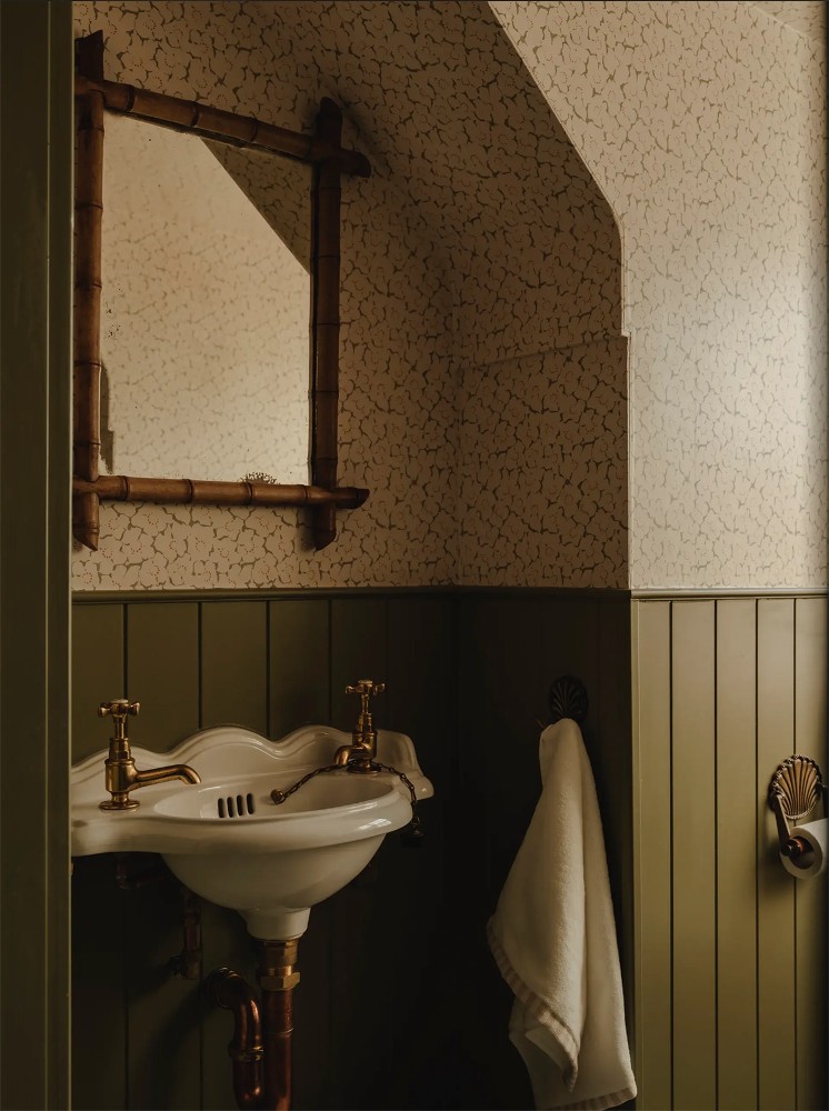
Sandbanks by House Nine - Image Credit: Joey Kendall Brown
In rooms with limited natural light, the thinking shifts to undertone. "You don't want to choose a color that feels cold or flat because there isn't enough natural light to bring it to life," she explains. A warm undertone holds its quality in a north-facing room in a way that a cooler tone will not, and a deeper, richer color can actually improve in low light rather than suffer from it. "I wouldn't shy away from something dark. A deeper, warmer wallpaper can actually make a low-light room feel really atmospheric and cozy." Naomi advises against assuming that a dark room needs a light wallpaper and working from that assumption rather than from what the room is actually capable of.
Choosing Wallpaper with Intention
The wallpaper choices that work best are rarely the result of luck. Someone thought carefully about scale, pulled the color story from the quieter tones in the pattern, and trusted their instinct when a bold choice felt right rather than talking themselves out of it. Treating wallpaper as a starting point rather than a finishing touch is what makes that kind of thinking possible.
Before finalizing anything, always make sure to order samples. A pattern seen in its actual space, under its actual light, has a way of making the right decision obvious and the wrong one equally so.
--
 Swatchbox is a premier sample fulfillment service for building product manufacturers. With proprietary software designed by insiders of the design community, Swatchbox helps manufacturers improve product sales and brand affinity by delivering material samples to the design community with speed, intelligence, and style. Learn more and join Swatchbox at www.swatchbox.com.



Comments