The Psychology of Color in Interior Design
“Color has the power to transform a space, evoke emotions, and tell a story. It's the soul of design, breathing life into every corner and capturing the essence of its inhabitants.”
 Kelly Wearstler
Interior Designer, Kelly Wearstler Studios
Color is ubiquitous in our daily lives, from the golden rays of the sun to the traffic lights we obey. But color isn't just a visual experience; it's a psychological one too. In the realms of art, marketing, and particularly interior design, the usage of color goes beyond mere aesthetics to influence our emotions, perceptions, and even our behavior. For homeowners and design aficionados, the ability to harness the power of color psychology can transform living spaces from mundane to magnificent. This comprehensive guide will unravel the psychological webs of color theory, providing insights that resonate with both industry professionals and those seeking to personalize their indoor sanctuaries.
An Introduction to the Chromatic Realm
Color psychology is a discipline that tries to examine how the human mind perceives and reacts to different colors. From ancient wisdom to modern-day science, colors have been associated with various moods, personality types, and even health outcomes.
Color psychology is the study of how different hues can provoke emotional responses, influence decision-making, and even impact health. In interior design, these effects are harnessed to create atmospheres that inspire, soothe, or stimulate. Centuries-old insights from philosophers and naturalists formed the bedrock of color theory. From Aristotle's scientific observations to Johann Wolfgang von Goethe's psychological considerations, the innovators of their times have played an integral role in further understanding the chromatic spectrum.
Why Is Color Psychology Important?
At Swatchbox, we aim to guide you through a spectrum of colors, shedding light on their meanings and practical applications. Whether you’re selecting paint, furniture upholstery, or carpet tiles understanding the psychological implications of color is the first step to curating a space that not only looks good but feels right.
Understanding The Color Wheel
Before we explore the emotions and behaviors that colors elicit, having a basic understanding of the color wheel and its fundamental principles lays a clear foundation for further conversation.
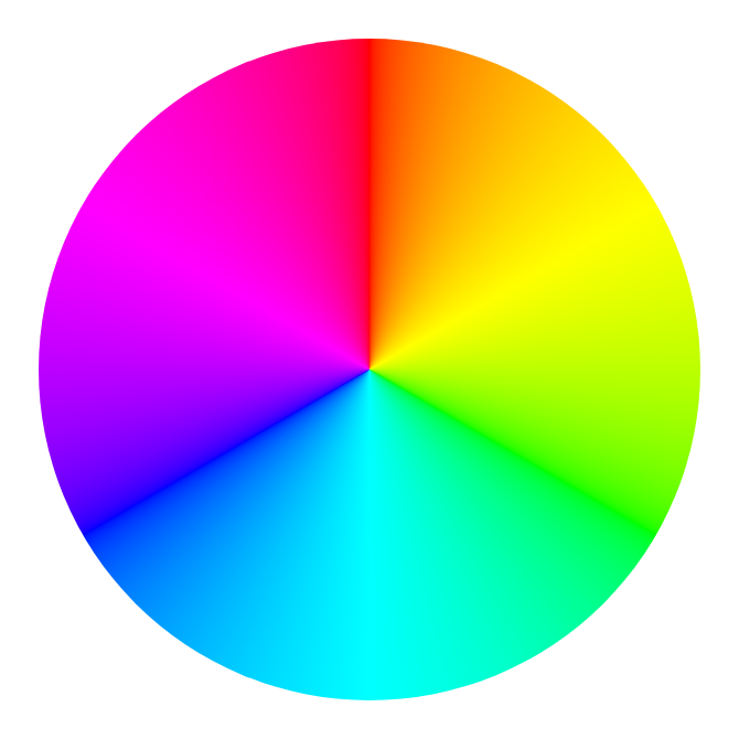
Intro to the Color Wheel
The color wheel is a traditional tool used to understand the relationships between colors. It consists of 12 colors in total, with three primary colors - red, blue, and yellow - spaced equidistantly from each other at its core.
The Harmony of Hues
Color harmony involves a pleasing arrangement of colors in the interior. We'll address the various applications of color harmony like monochromatic schemes and complementary contrasts.
Vocabulary of Visuals
To create a cohesive space that tells a story, you as the designer must be conversant in the language of hue, saturation, and contrast, which are the raw materials of any design palette.
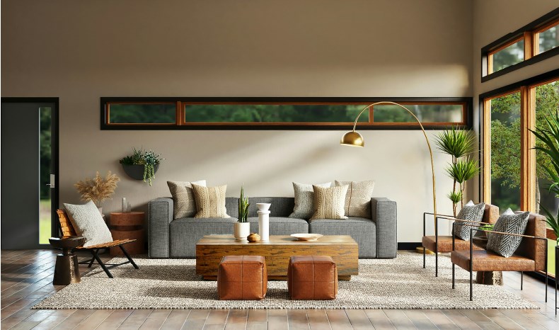
The Impact of Colors
Each color carries with it a rich tapestry of cultural and psychological associations. We'll dissect the emotional baggage associated with the primary and secondary colors, immersing ourselves in their nuanced meanings and significance.
Red - The Fire of Passion
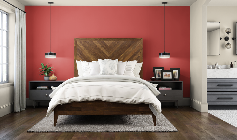
A color that commands attention, red is synonymous with intensity, power, and desire. Used sparsely, it can energize a space, but overabundance may lead to a sense of aggression and hostility.
Blue - The Serene Waters
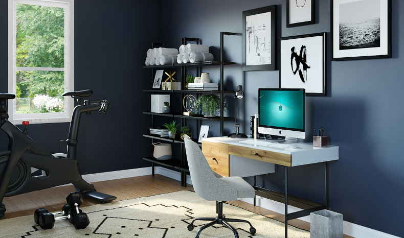
The color of the sky and sea, blue is known for its calming properties. It carries a sense of tranquility while simultaneously projecting integrity and professionalism, making it a versatile candidate for both residential and corporate environments.
Yellow - The Spectrum of Sunshine
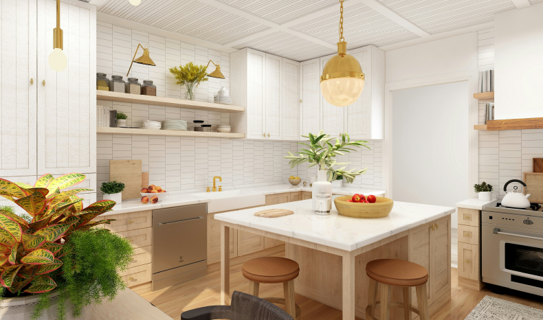
Yellow is the dawn of a new hope, evoking feelings of warmth and happiness. Commonly labeled as “the most visible color”, it can serve as an accent to capture attention or a dominant presence to spread cheer.
Green - The Verdant Vision
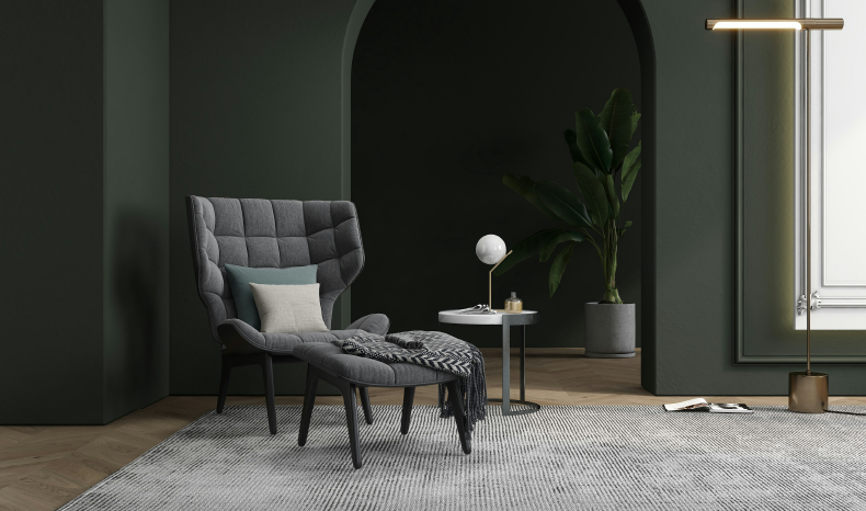
Green, by its very nature, represents life, growth, and fertility. It is the color of balance, a serene bridge between the energetic warm colors and the calm cool spectrum.
Purple - The Regal Blend
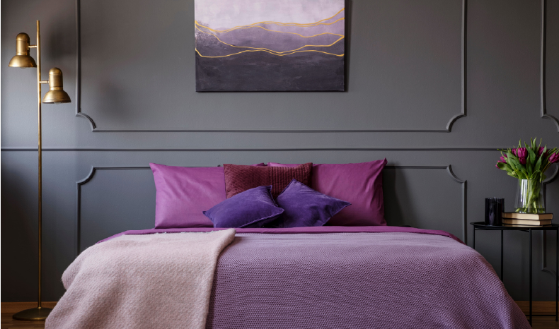
Long associated with royalty, purple carries an air of luxury and sophistication. Its use in interior design speaks to a refined taste and a certain creativity.
Orange - The Citrus Sunrise
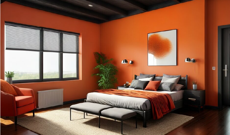
Orange encapsulates the vibrancy of red and the cheerfulness of yellow. It radiates warmth and energy, which can be well-suited for spaces that encourage social interaction and productivity.
Black and White - The Seam of Opposites
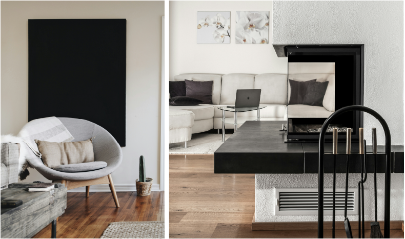
These are the colors at the extremes of the chromatic spectrum. White signifies purity and innocence, whereas black can symbolize power, sophistication, or the void. Together, they create a stark contrast that's both bold and beautiful.
Your Next Palette
Apply this profound knowledge of color psychology throughout your next project. With introspection and inspiration, the colors in your environment can be a vibrant reflection of your deepest desires, and the world you create has the potential to resonate on a level beyond the visual and enrich the human experience one shade at a time.


Comments