

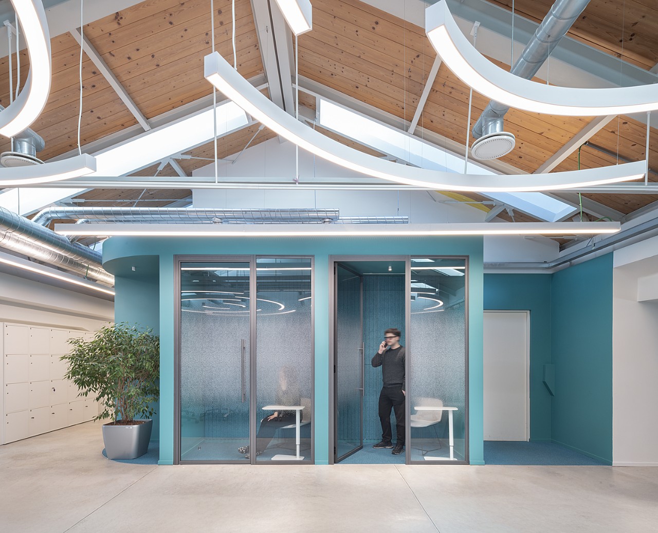
Designing an office for a tech company can mean working around a color before you have chosen one. The client might have a signature color of its own, a competitor’s signature color may be completely off limits, and the palette has to find its way between the two. Marco Castiglioni, a Milan-based designer at Il Prisma, has worked within constraints like these for years, and the way he approaches color today comes from going back to see how people actually use his spaces once they have opened.
Working with Brand Colors
Much of Marco’s commercial work begins with a color someone else has already chosen. Sometimes the company’s own color is mandatory, so the design starts there and everything else is matched to it. Other times the company does not want its color in the space at all, and the design begins from a concept instead. In both cases he starts by asking what the space is meant to do, using the familiar warm and cool split as a first filter, with reds and oranges bringing energy and blues and light grays calming a room.
Over the past five years or so he has noticed a change in how brand color is meant to appear. Companies increasingly ask for it as an accent in the places where clients are welcomed, such as the reception or the boardroom, while open-plan areas, meeting rooms, and break areas move toward a warmer, more natural palette in which the materials provide much of the color. He avoids applying a brand identity too literally, particularly through large graphics or posters, which can make an office feel more like a storefront than a place where people actually work. Chair upholstery, the metal frame of a piece of furniture, table legs, and small decorative elements are where he prefers to place corporate colors, so that the color becomes part of the architecture of the interior. “The aim is to make the company’s identity recognizable without allowing it to become overwhelming,” he explains.
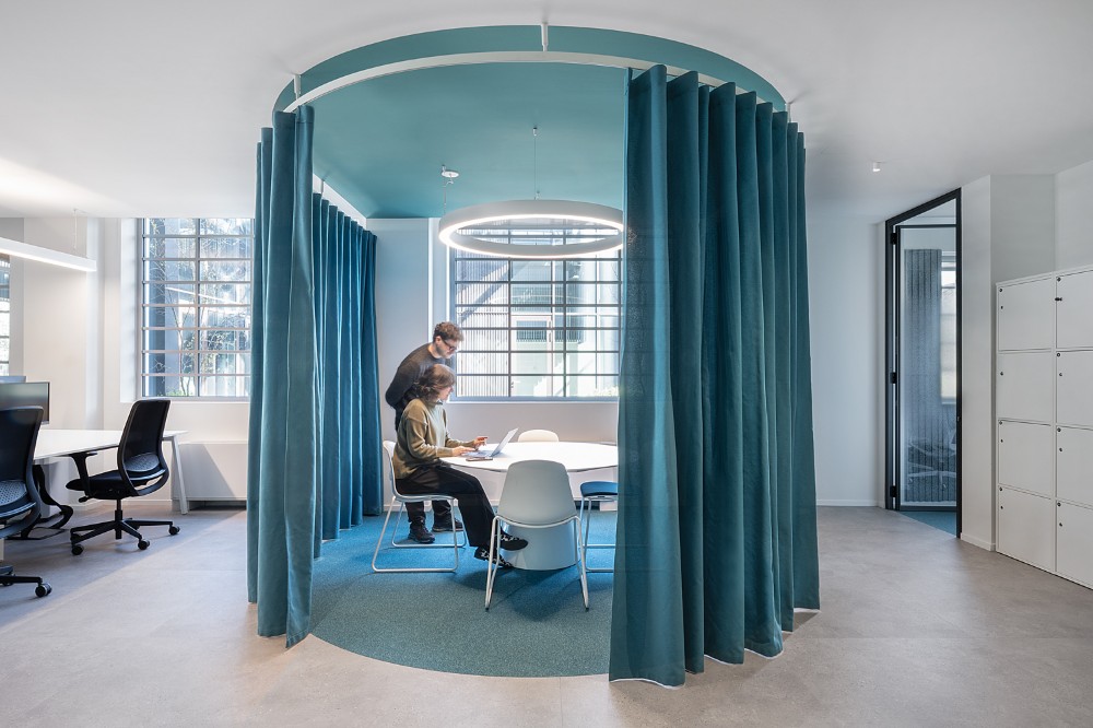
Neuman & Esser by Il Prisma - Image Credit: Carola Merello
Testing a Palette Against Daily Use
On a pharmaceutical project, Castiglioni’s client arrived with a company palette of purple, yellow, and brown and asked for all three to be used, which took some work to balance. The team used color blocking to give different meeting rooms their own character, with purple for phone calls, closer and more private, and yellow for collaboration, more energetic and exciting. On paper the logic held together well.
Once the rooms were occupied, the yellow one told a different story. “The yellow room, which had looked very successful on paper, turned out to be excessively bright and visually intense for the people using it every day,” he says. He describes it as visually noisy, to the point that people did not enjoy spending time there. The problem only became apparent after the space was in use. The team kept the concept and rebalanced it, bringing in furniture and artwork in light gray tones to make the yellow less dominant. “We did not want to remove the room’s distinctive character, but rather find a better balance between the original design intention and the visual comfort of the people using the space,” Castiglioni explains.
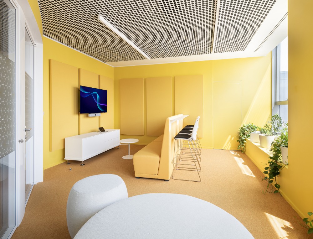
Pharmaceutical Company Office by Il Prisma - Image Credit: Carola Merello
That experience shapes how he approaches color problems in general. In most cases there is no need to start from scratch, since a wall can be repainted, a finish changed, or a new element introduced to rebalance a palette that has become too strong. The more useful question is where the problem sits. “The important thing is to understand whether the problem lies in the color itself or in the way it interacts with the other elements of the space, such as light, materials and proportions.”
Elsewhere on the same project the palette shows up in smaller doses, with a single yellow lounge chair and purple carpet set against a natural living wall and neutral gray tones.
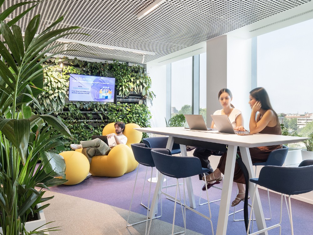
Pharmaceutical Company Office by Il Prisma - Image Credit: Carola Merello
Using Color to Organize an Open Floor
In large open-plan areas, Castiglioni treats color as a way of making a space legible. Instead of assigning a different color to every function, he builds a visual hierarchy: he identifies the main areas or activities and gives each a recognizable character through palettes that stay consistent and work well together. Continuity matters here too, so color moves across floors, furniture, fabrics, and materials and does not stay on the walls, which lets each area have its own identity while the floor as a whole still reads as one place.
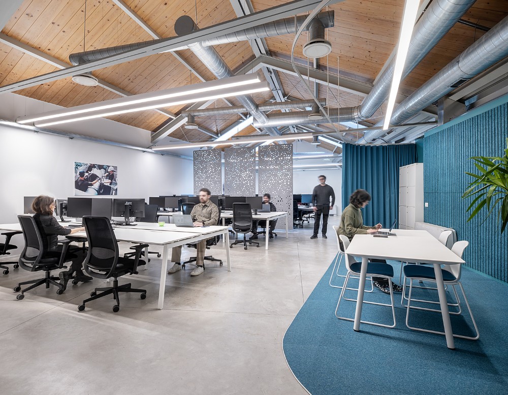
Neuman & Esser by Il Prisma - Image Credit: Carola Merello
An office also has to keep working as the company around it changes. “An office is a space that needs to evolve along with the organization,” according to Marco. He aims for environments with a strong identity that are not tied to a particular generation, trend, or personal taste, looking for “a balance between character and neutrality” while keeping visual comfort and different sensitivities in view.
Color That Comes from the Material
In recent years Castiglioni has become interested in what he calls honest materials and colors, the idea that color can come directly from a material and need not be applied to it. If he wants to introduce an orange tone into a project, he looks first for a material that naturally carries it, such as brick or cork, before reaching for paint or a colored surface. “I believe this approach gives spaces greater depth and authenticity,” he says. In his view the color then becomes a consequence of the material’s own qualities, textures, and imperfections.
He applies the same thinking to a sense of place. Wherever possible he tries to bring “local vibes” into an office, through materials, colors, or cultural references that tell the story of the surrounding area, which helps spaces feel more authentic and less standardized, especially on projects for international companies.
Having the Color Conversation
Clients tend to pull in two directions. Over the past couple of years Castiglioni has watched offices move toward beige and gray, which offer comfort and a kind of global agreement among a large group of people, so the palette feels like a safe choice. His response has been to keep working with similar, restrained palettes while looking for places to introduce a spot color or a different material, so that each project does not end up a copy of the last.
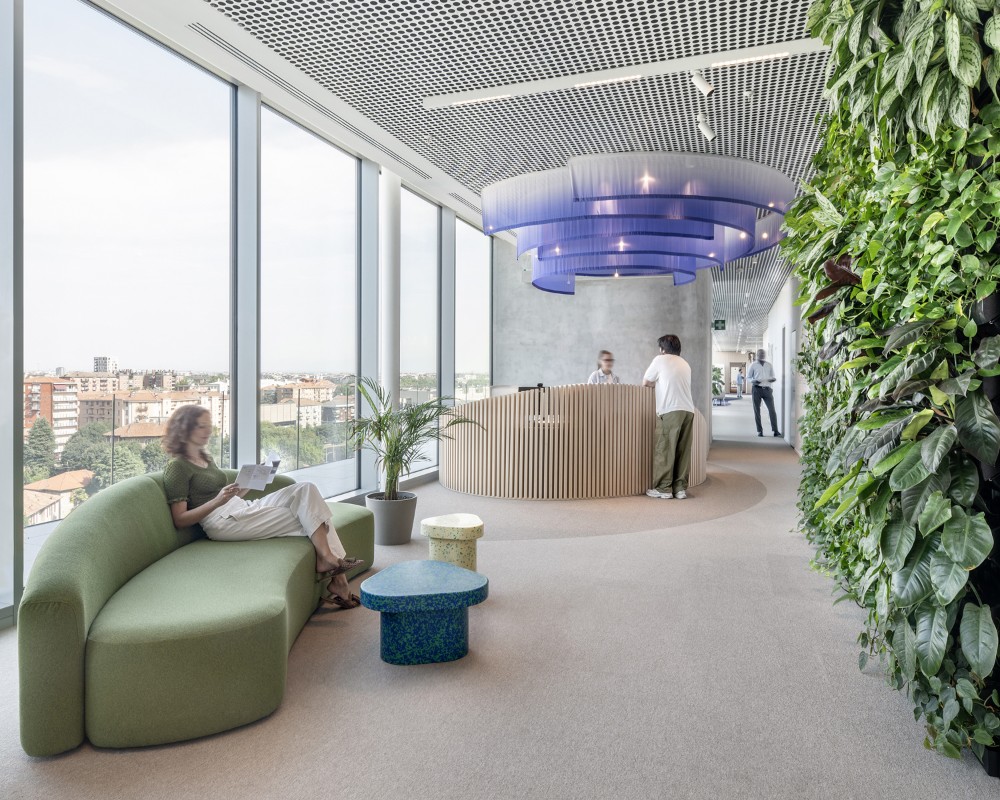
Pharmaceutical Company Office by Il Prisma - Image Credit: Carola Merello
Other clients assume that more color makes a happier, more beautiful space, and he tells them that is not what it does. Marco raises it early, in brainstorming sessions and collaborative activities to define the look and feel, and prepares several moodboards with references that can differ widely from one another. They show how the same color behaves depending on its quantity, the surfaces it is applied to, and the materials it is combined with. “My goal is not simply to present a solution that I believe is right, but to build a critical perspective on the project together with the client,” he explains. Through that visual comparison, clients often begin to see that the quality of a space is not determined by how much color it contains, but by how thoughtfully that color is used and the meaning it is given.
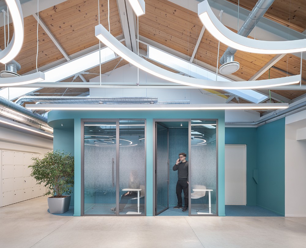
Neuman & Esser by Il Prisma - Image Credit: Carola Merello
Advice on Using Color Boldly
Marco's advice for designers who feel nervous about bold color is to avoid limiting themselves too early and to avoid using color without thought. Understanding the client comes first, including how open they are to experimenting, and after that comes the courage to try things. “Sometimes a choice that initially seems too bold can turn out to be exactly what gives a space its character and identity,” he says. “The important thing is to have a clear reason behind every color decision and to understand why you are making it.”
--
 Swatchbox is a premier sample fulfillment service for building product manufacturers. With proprietary software designed by insiders of the design community, Swatchbox helps manufacturers improve product sales and brand affinity by delivering material samples to the design community with speed, intelligence, and style. Learn more and join Swatchbox at www.swatchbox.com.


Comments