Here's an idea: walk into a thoughtfully designed restaurant or workplace and count the finishes.
The count will probably reach eight materials, maybe more. Terrazzo flooring transitions to oak herringbone. Brushed brass meets blackened steel. Somehow, it all holds together because each material serves the same central idea.
The same exercise in a poorly designed space tells a different story: three materials fight for attention when they answer different questions.
The difference isn't about restraint: it's about having a concept that gives every finish a reason to be there.
Why the Three-Material Rule Exists (and When to Ignore It)
Interior design education often starts with a rule: limit the design to three materials per space.
The three-material rule serves a purpose in education. It forces students to see relationships.
The rule teaches editing. Working designers develop the judgment to know when a space needs more... or less. Balance might mean two materials in a compact powder room. It might mean ten in a 5,000-square-foot office. The number itself matters far less than the logic connecting them.
Confidential client by Il Prisma
Material count scales with spatial complexity, programmatic diversity, and conceptual ambition.
A single-use room with clear boundaries can feel complete with minimal intervention. A multi-zone environment serving different functions throughout the day requires more variation to articulate those shifts. The question becomes: what does this space need to communicate?
Building From Concept
Milan-based designer Marco Castiglioni of Il Prisma frames his entire process around a central idea.
"The starting point is always the overall concept," he says. "The materials and textures have to reflect that idea and translate it into atmosphere."
This is where designers often stumble. They select one beautiful piece at a time, each for its own merits, with no thread connecting them.
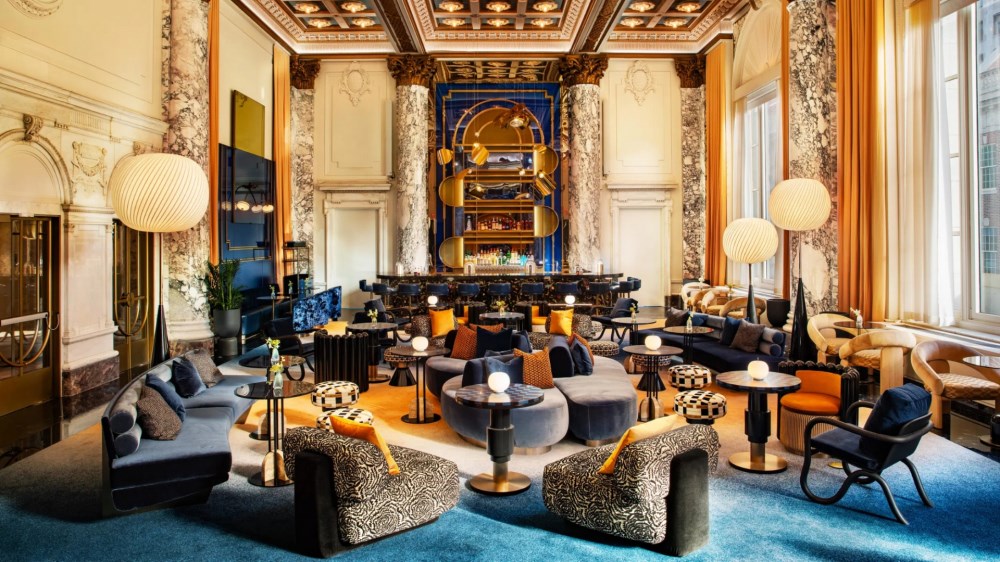
The alternative shows in projects where concept drives every choice. Rockwell Group's W New York Union Square demonstrates how architectural scale can support material abundance.
The second-floor ballroom reimagines the historic Guardian Life Building's Beaux-Arts grandeur as a contemporary living room. Double-height ceilings and white marble columns with Corinthian capitals establish the framework. A mix of stone, metallic and soft textures work well within this ornate backdrop. The concept gives each material permission to be bold.
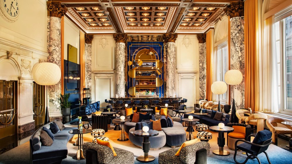
W New York Union Square by Rockwell Group - Image Credit: www.rockwellgroup.com
Castiglioni adds a critical layer: "The most important thing is to create a level of importance. You need a hero material, and everything else has to support it." This hierarchy operates spatially and visually.
The hero material typically claims the most surface area or occupies the most prominent position. In a residential project, that might be wide-plank walnut flooring flowing throughout the main living spaces. In a restaurant, it could be the dramatic stone feature wall behind the bar.
Supporting materials play specific roles. Some provide textural contrast. Others introduce color variation or shift the sensory experience from one zone to another. A few exist purely for function but get selected to align with the overall concept.
Private residence by Marco Castiglioni - Image Credit: Alessandro Famulari
The hierarchy also manifests in visual intensity. When the hero material has strong veining or a bold pattern, supporting materials need restraint. If the dominant finish is minimal, the palette has permission to introduce more character elsewhere.
One of the most effective techniques for managing material diversity is to use the same material in different forms. This creates continuity while building visual interest. Oak might appear as solid flooring in one area, thin veneer paneling on a feature wall, and turned spindles in a stair balustrade. The material connects all three applications, but the varying expressions keep it interesting.
This approach satisfies two competing needs. The palette gets the variety required to articulate different zones and functions. It also gets the consistency that holds everything together. The technique works particularly well in open-plan environments where material transitions need to feel intentional. Carrying a finish through multiple applications ties spaces together even as other materials shift.
The Floor as Anchor
Flooring deserves special attention in any discussion of material diversity. It's the one surface that touches every part of a space and influences how people move through it. In projects with multiple materials across walls, ceilings, and furnishings, consistent flooring often provides the stabilizing force. A single floor finish can unify six different wall treatments.
This is especially true in workplace design, where different departments or work modes require different atmospheres. Marketing might need energizing color and texture, whereas finance prefers calm neutrality. Meanwhile, the boardroom demands gravitas. A continuous floor material allows those variations to exist as deliberate choices rather than accidents.
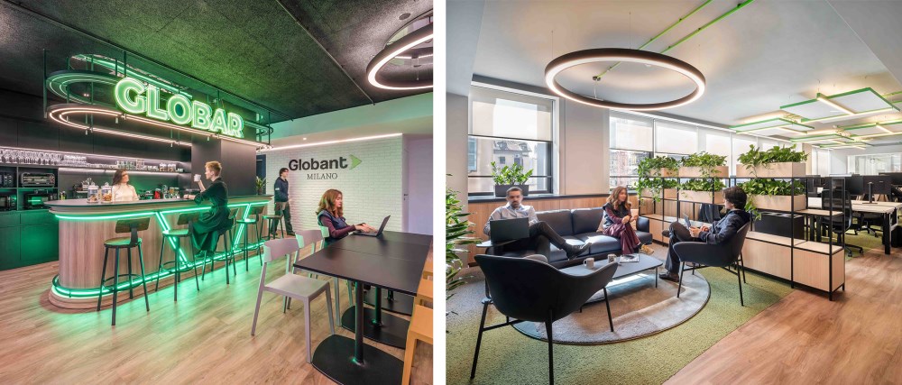
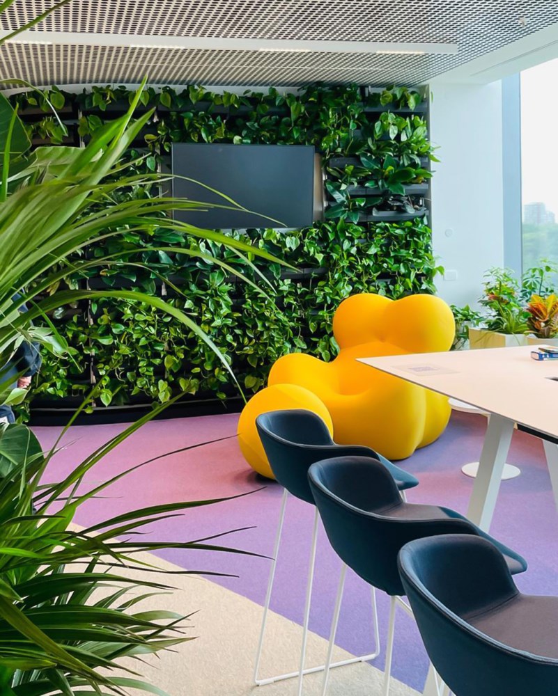
Globant Milan Office by Il Prisma – Image credit: Carola Merello
The reverse holds equal power. When flooring changes, it signals a meaningful shift.
Transition from wood to tile and you've crossed into a different functional zone. Move from carpet to polished concrete and the formality level drops.
These transitions work best when they align with architectural moments. A change in ceiling height, a column line, or a shift in natural light levels. The material change reinforces what the space is already telling you.
Temperature and Balance
Material temperature creates another layer of cohesion or conflict. Warm woods, terracotta, brass, and cognac leather sit on one side of the spectrum. Cool stones, concrete, steel, and gray textiles occupy the other. Most successful multi-material spaces land somewhere in the middle, using temperature to create balance. A predominantly warm palette benefits from strategic cool accents. Walnut cabinetry and travertine tile might want blackened steel hardware and charcoal upholstery to ground the space and prevent it from feeling overly soft. Cool-dominated schemes often need warming influences to avoid feeling sterile.
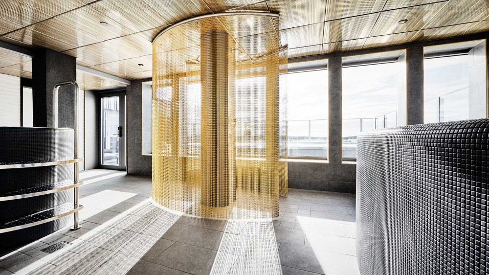
Kust Hotel and Spa by ETTELVA Arkitekter and Mer Architects
Lighting plays into this calibration in ways many designers overlook. The relationship between material temperature and light temperature shapes how a space feels throughout the day.
Warm materials under warm lighting can create an overly saturated effect. Cool materials under cool lighting can feel clinical. The most comfortable spaces pair materials and lighting in gentle opposition.
Compact Spaces Require Discipline
All of these principles intensify in compact environments. Small rooms have less surface area to distribute across multiple finishes. Each material claims a larger percentage of the visual field. A powder room might only accommodate two or three finishes before feeling busy. A studio apartment needs careful editing to avoid overwhelming its footprint.
The hero material concept becomes critical here. In a small space, that dominant finish needs to work harder. It should be interesting enough to carry the room on its own merits. Secondary materials in small spaces often work best when they occupy functional elements: hardware, lighting, a single accent wall. They punctuate rather than compete.
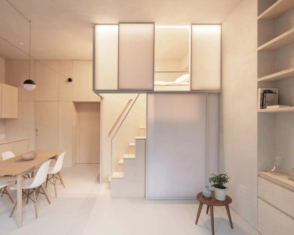 Shoji Apartment by Proctor & Shaw - Image Credit: Stale Eriksen
When to Stop
The hardest part of working with multiple materials is knowing when to stop.
Every project reaches a tipping point when materials get added to solve problems created by previous material choices. That sixth finish is there to mediate between materials four and five. This signals a conceptual problem, an editing problem disguised as a gap. The strongest multi-material schemes feel inevitable. Every finish had to be there.
The designers who handle material diversity best treat it as a conceptual exercise before it becomes a specification task. They establish the organizing idea first, then let materials emerge as answers to that central question. Sometimes the answer is three materials. Sometimes it's ten. The confidence comes from knowing each one serves the concept rather than dilutes it.
When the logic is clear, the palette follows.
--
![]() Swatchbox is a premier sample fulfillment service for building product manufacturers. With proprietary software designed by insiders of the design community, Swatchbox helps manufacturers improve product sales and brand affinity by delivering material samples to the design community with speed, intelligence, and style. Learn more and join Swatchbox at www.swatchbox.com.
Swatchbox is a premier sample fulfillment service for building product manufacturers. With proprietary software designed by insiders of the design community, Swatchbox helps manufacturers improve product sales and brand affinity by delivering material samples to the design community with speed, intelligence, and style. Learn more and join Swatchbox at www.swatchbox.com.


Comments