
A small space has a way of exposing every decision a designer makes. In a generous room, a material choice that doesn't quite work can be absorbed by the surrounding space. In a compact one, there is nowhere for it to hide. Every finish is visible from every other finish, every surface is in conversation with the one beside it, and the relationships between materials become impossible to ignore. Too many variables and the room stops feeling composed. It feels restless, cramped and hard to be in.
Milan-based designer Marco Castiglioni of Il Prisma has spent years working across offices, retail spaces, and commercial interiors where tight footprints are the norm rather than the exception. He approaches small-space design through the lens of materials, recognizing that in a compact room every surface affects the next.
He explains: "You have to keep in mind that all the materials are stuck together. There are always points of contact between them. So you have to choose materials that can work together and create the right balance. When you work in a small space, you have to define the line and stay near it."
That is why he pushes back on clients who want to cram too much in. The line, once defined, has to hold.
Reading the Light
Before material selection begins, Castiglioni reads the light, treating it as the variable that shapes every decision that follows. In a space with generous natural light, his instinct is to work with warm, pale tones like light whites and soft beiges. This allows the room to breathe and feel larger than its footprint suggests. Pale colors reflect light back into the room, and when light bounces across surfaces it pushes walls and ceiling outward perceptually. This creates a sense of openness that no amount of clever furniture arrangement can replicate. In that context, strong color or heavy pattern works against the space rather than with it.

Haymarket Café by Ossian - Image Credit: www.ossianarchitects.com
When natural light is limited or absent, the opposite is true. Rather than fighting the darkness, Castiglioni leans into it. He uses deep tones and a color blocking technique, using dark, consistent materials across surfaces, can actually eliminate the sense of depth in a room. "With dark materials and a smooth light, you can cut the perception of perspective," he explains. "You don't feel the real dimension of the space."
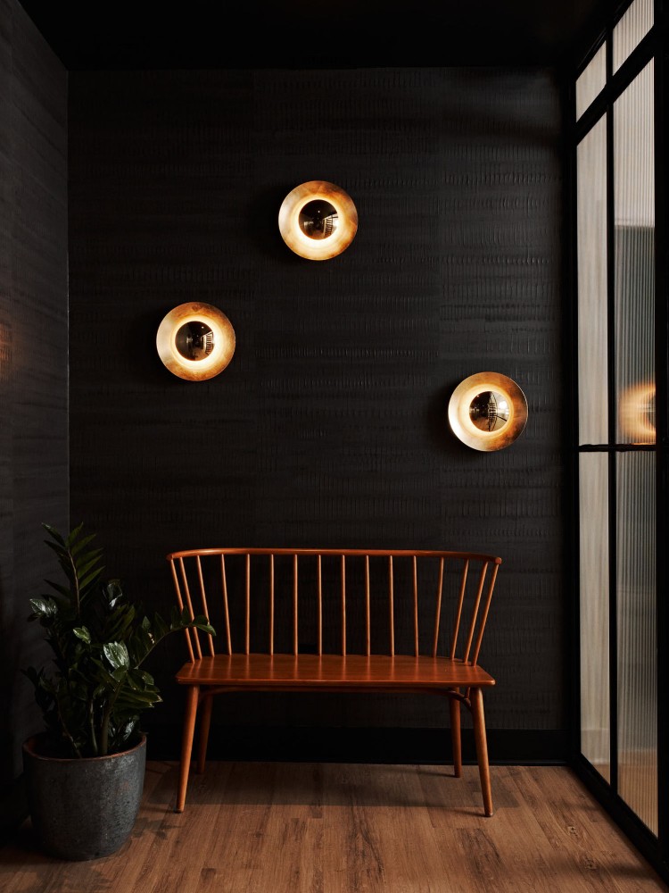
Muse Atlanta by Aterlier Davis - Image Credit: https://atelierdavis.com
It is a counterintuitive move, but in the right conditions a dark compact space reads as intimate and considered rather than small and dim. The key is committing to it fully rather than hedging with lighter accents that undermine the effect.
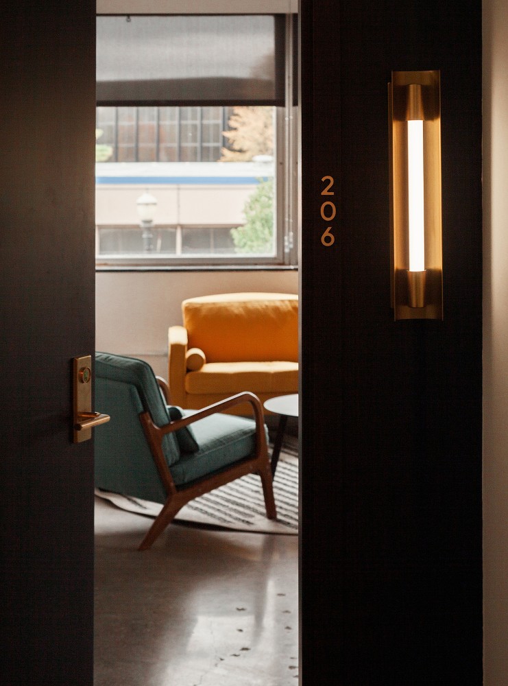
When natural light is absent and dark tones don't fit the design, mirrors and mirror surfaces are helpful tool for designers. Used with intention rather than as a reflexive fix, mirrors can dramatically change the feel of a room.
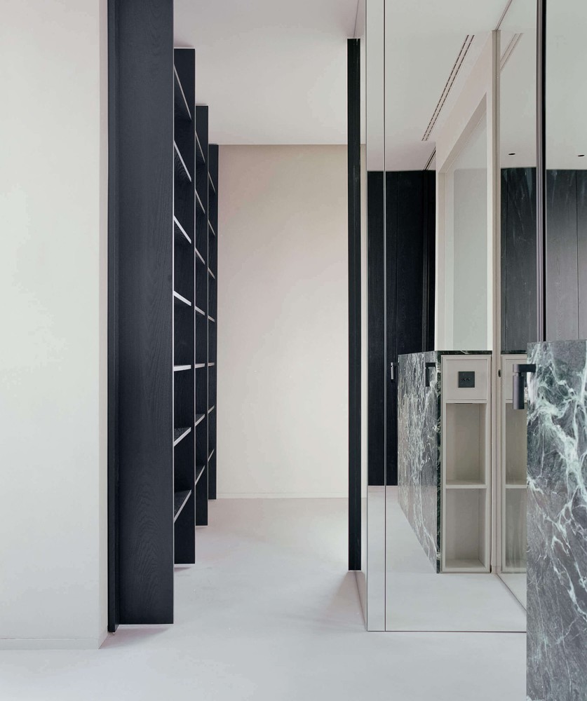
Breda by Aterlierzero - Image Credit: https://www.atelierzero.it
An important thing to note, however, is that mirrors reflect both the good and the bad. A cluttered or unresolved space will simply double its own visual noise.
Flooring
Castiglioni identifies flooring as the element with the greatest overall impact, covering the most surface area and setting the tone before anything else in the room registers. In small spaces, flooring carries that responsibility more than anywhere else. The less it interrupts the eye, the larger the room feels. The more a floor is divided, the more the room announces its own boundaries.
A seamless continuous floor and a mosaic-tiled floor of identical dimensions will feel like different sizes entirely, not because anything structural has changed, but because one surface asks the eye to keep moving while the other stops it at every joint. Castiglioni's preference is for resin, or continuous poured surfaces. "With resin, you don't have the tiles on the floor, so you can do what you want," he says.
Klinker Apartment by Colombo Architecture - Image Credit: Roberto Ruiz
That doesn't mean that tiles are off the table, but it's important to note that large-format tiles tend to work against a compact space rather than with it. When only two or three tiles span the entire floor, the grout lines lose their rhythm and begin to map out the room's limitations rather than receding into the surface. That's why smaller tiles work better.
The same thinking applies to pattern. Large herringbone or wide plank timber can overwhelm a small floor, but small-format herringbone, a traditional Italian parquet style, is a different proposition entirely. The scale of the pattern stays proportionate to the scale of the room, and the material retains its character without dominating the space.
Sperlari by Il Prisma - Image Credit: www.ilprisma.com
The direction of flooring also plays a quiet but meaningful role. In narrow spaces, laying planks or tiles on a diagonal tends to open out the perceived area, while in a hallway or elongated room, horizontal layouts visually stretch width and prevent the space from feeling like a tunnel. These are decisions that compound steadily across the design to make the space feel larger.
Walls
Castiglioni avoids treating every wall as something that needs to be used, especially in small spaces. Covering all four walls with material, pattern, or texture creates what he calls "a big mess," with surfaces competing with each other in a room that has no capacity to absorb the conflict. His preference is to treat walls with warm, neutral finishes that support the sense of openness rather than interrupt it. If a wall treatment is used at all, it belongs on one side only, with the remaining walls kept calm and undemanding.
When using patterns, scale matters considerably. Small, delicate repeats add texture and personality without drawing the wall closer, while large, bold patterns create focal points the eye locks onto, pulling surfaces in and making the room feel more enclosed. A carefully chosen horizontal stripe can suggest width, while vertical elements like paneling, striped wallpaper, or floor-to-ceiling curtains, draw the eye upward and create the impression of greater ceiling height.
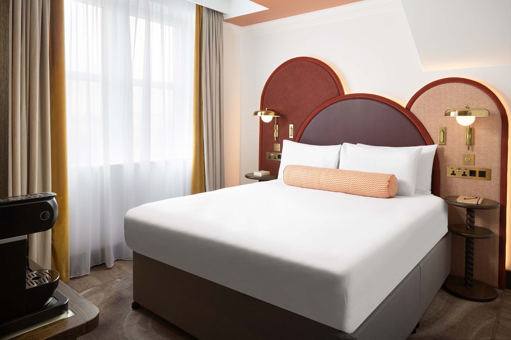
The Welbeck Hotel London by Il Prisma - Image Credit: www.ilprisma.com
Where Castiglioni does introduce wall character in compact spaces, he tends to go with a low boiserie, perhaps 70 centimeters from the floor, that adds texture and definition without claiming the full height of the wall. It grounds the space without closing it in, which is important when volume is already limited.
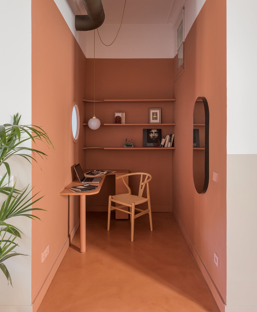
Color
Castiglioni's small-space strategy includes a deliberate use of color across planes to manipulate how a room is perceived. In a well-lit space, he might use a lighter floor and ceiling with slightly deeper tones on the side walls, a move that draws the walls apart and makes the room feel wider than it is.
Aon Roma by Il Prisma - Image Credit: www.ilprisma.com
In a darker space, running the same tone across the floor, walls, and ceiling creates a unified envelope that removes the sense of boundary altogether. The room stops feeling like a box with defined edges and starts feeling like an atmosphere.
Twin Peaks Residence by Lim+Lu - Image Credit: Nirut Benjabanpot
The technique only works when the palette is tightly controlled. "If you work with brown on the floor, green on one wall, orange on another, you create a mess that isn't balanced and doesn't work together," he says. The color blocking approach requires commitment to a narrow range, because the coherence between surfaces is precisely what creates the spatial effect.
 Down's Park Residence by Studio Anton - Image Credit: www.studio-anton.com
Furniture
Material and color discipline only works if the furniture doesn't undermine it. In compact spaces, Castiglioni starts with proportion before aesthetics, because a beautiful piece that overwhelms a room is still the wrong piece. His preference is for fewer items with a clear function rather than many smaller elements that introduce visual noise without adding value.
Pieces with raised legs tend to serve small spaces well, allowing the floor to remain visible beneath them and preserving the sense of continuity that makes a room feel open. Furniture that sits heavily on the floor and blocks the surface beneath it can make an already tight space feel anchored in the wrong way.
Glunz Hall by Studio Vertex - image credit: Matt Goellner
Castiglioni actively pursues material continuity between furniture and architecture. When a furniture piece shares a material already present in the space, whether that is the same timber species, a matching stone, or a complementary textile, it reads as part of the room rather than something placed inside it.
Natural materials like wood bring warmth and make small spaces feel more welcoming, while metal or polycarbonate details can add a contemporary lightness without adding visual weight. And wherever possible, furniture should be kept away from windows and important sightlines, so natural light remains unobstructed and the room retains its connection to the outside.
Oakland Garden Home by Atelier Cho Thompson - www.chothompson.com
Lighting
In a small space, a single overhead fixture is one of the more limiting choices a designer can make. It flattens surfaces, casts shadows in the wrong places, and does nothing to push the boundaries of the room outward. Layered lighting, combining ambient, task, and accent sources, changes that entirely. Each type plays a different role, and together they create a sense of depth that a single light source simply cannot.
Indirect lighting is particularly worth understanding in this context. When light is directed at a wall or ceiling rather than straight into the room, it makes those surfaces appear farther away. The room doesn't change, but the perception of it does, and in a compact space that distinction matters more than almost anywhere else.
La Galerie Italienne by Hannes Peer Architecture - Image Credit: www.hannespeer.com
The discipline small spaces demand is not about settling for less. It is about understanding that coherence does more work than variety ever can. It's important to choose materials that can hold a space together even when it is tight. When the palette is controlled and the logic is clear, a small room can feel entirely intentional, shaped by careful thinking rather than limited by its dimensions.
--
![]() Swatchbox is a premier sample fulfillment service for building product manufacturers. With proprietary software designed by insiders of the design community, Swatchbox helps manufacturers improve product sales and brand affinity by delivering material samples to the design community with speed, intelligence, and style. Learn more and join Swatchbox at www.swatchbox.com.
Swatchbox is a premier sample fulfillment service for building product manufacturers. With proprietary software designed by insiders of the design community, Swatchbox helps manufacturers improve product sales and brand affinity by delivering material samples to the design community with speed, intelligence, and style. Learn more and join Swatchbox at www.swatchbox.com.


Comments