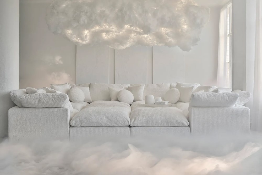
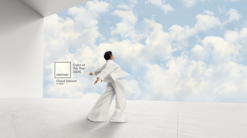
Pantone has selected Cloud Dancer (PANTONE 11-4201) as its 2026 Color of the Year. The soft white joins a palette trend toward lighter, more neutral foundations in residential interiors. This marks the first time Pantone has chosen a shade of white since launching the Color of the Year program in 1999. Previous selections have leaned toward vibrant or expressive hues, such as Viva Magenta, Peach Fuzz and Classic Blue. This shift toward neutral reflects something the Pantone Color Institute observed in global consumer behavior and cultural patterns. Leatrice Eiseman, Executive Director of the Pantone Color Institute, describes Cloud Dancer as a whisper of serenity. She notes the color responds to what she calls "the cacophony that surrounds us," pointing to increased screen time, constant news cycles, and the visual noise that defines contemporary life. The choice of white speaks to a desire for visual rest.
A Foundation for Biophilic Spaces
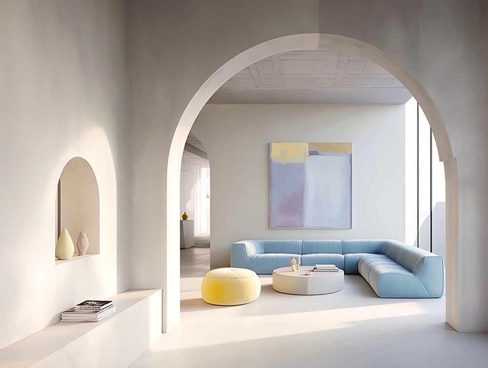
Cloud Dancer aligns directly with the ongoing shift toward biophilic design. This approach connects people to nature through built environments, using natural materials, sustainable practices, and people-first spaces to redefine wellness and comfort in modern interiors. Clients often request materials that reference the outdoors and palettes that don't compete for attention. Lighter tones, natural textures, and quiet transitions between elements define much of what's happening right now.
This year's color functions as the ideal foundation for biophilic interiors because it mimics natural light itself. It doesn't impose a mood. Instead, it amplifies whatever natural elements surround it. When paired with materials like reclaimed wood, natural stone, or organic textiles, Cloud Dancer lets those textures and tones become the focal point. The white recedes, allowing the biophilic elements to communicate directly with the people in the space.
This matters particularly as clients become more intentional about material choices. They want to understand where materials come from, how they're produced, and what impact they have on indoor environments. Cloud Dancer supports this transparency by providing a clean backdrop that makes material quality immediately visible. The white doesn't hide anything or distract from the authenticity of the materials themselves.
Creating Depth Through Material Selection
A white this light requires intentional material choices. The difference between a space that feels serene and one that feels sterile comes down to texture, undertone, and layering. Here's what works:
Warm woods
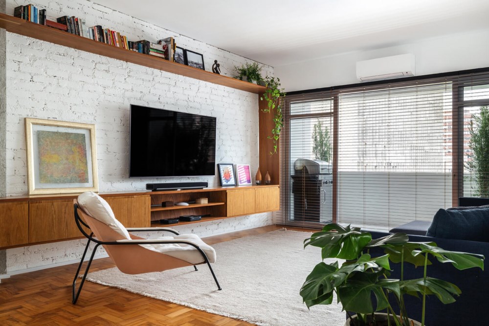
Wood grain patterns add movement and their warm undertones keep the space from feeling cold or clinical. Oak, ash, and lighter walnut tones are excellent choices.
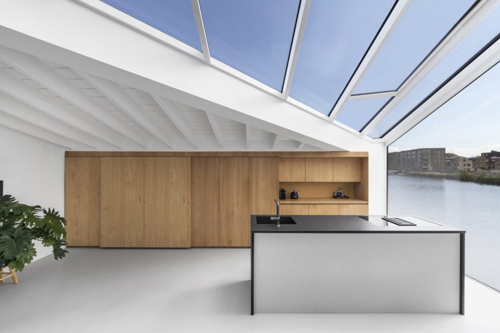
Floating Home by i29 Architects - Image Credit: Ewout Huibers
Textured surfaces
Textures transform how Cloud Dancer reads across the room. They catch light at different angles and create depth that flat surfaces can't achieve. For example, ribbed acoustic panels create dimension through shadow and ligh, while exposed brick underneath the paint brings an artisan quality that feels personal rather than mass-produced.
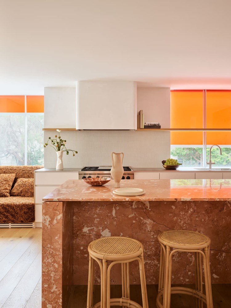
Apartamento Jardins 131 by INÁ Arquitetura - Image Credit: Maura Mello
Stone with character
Stone grounds the palette while maintaining lightness. Creamy limestone offers geological warmth, brushed travertine displays natural veining and soft beige quartz delivers durability with gentleness. These materials work well for countertops, backsplashes, bathroom surrounds, and fireplace cladding.
Camp Cover House by Tobias Partners - Image Credit: Anson Smart
Layered textiles
Natural textiles introduce warmth and tactile comfort. Jute, sisal, and wool rugs each offer different organic textures underfoot, while cotton and linen blends breathe with the seasons. Wool throws invite touch and relaxed drapery in natural materials filters light beautifully, softening architectural edges. Cloud Dancer holds these layers without competing, allowing the textiles to add warmth while maintaining the overall sense of lightness.
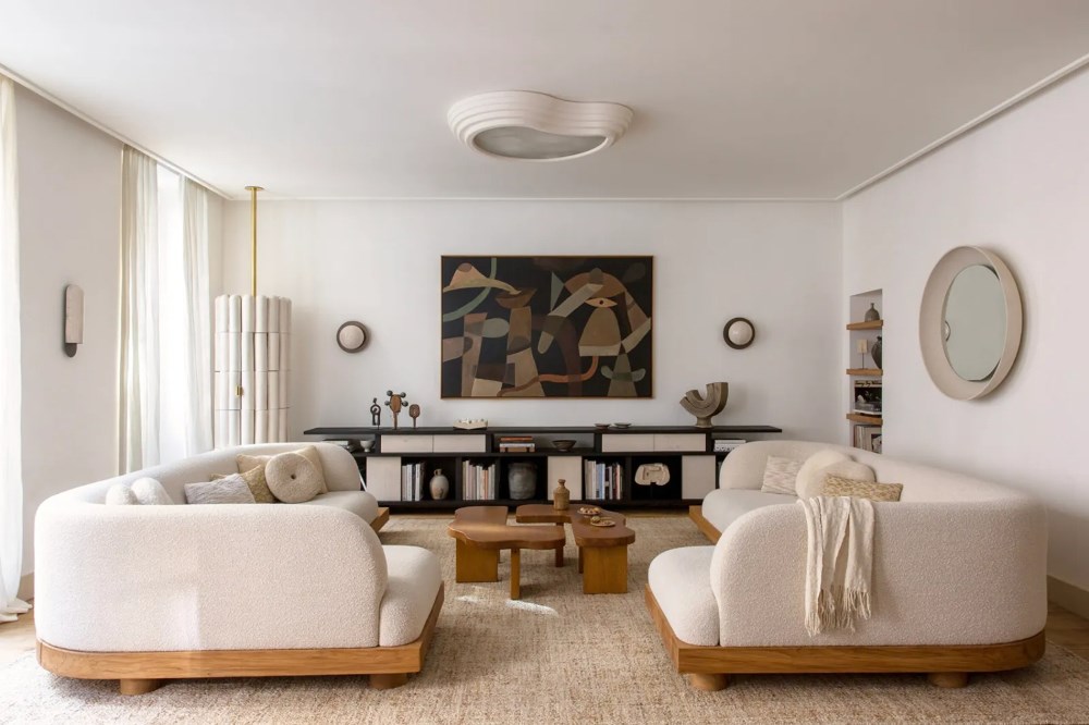
Bonne Nouvelle by Emmanuelle Simon - Image Credit: Damien de Medeiros
Warm metals
Metallic finishes lift Cloud Dancer without creating harsh contrast. Brushed brass catches light with a soft glow, champagne bronze adds restrained elegance and satin nickel provides a cooler option that still feels sophisticated. These finishes work as cabinet hardware, lighting fixtures, plumbing fixtures, and small accents throughout the space.
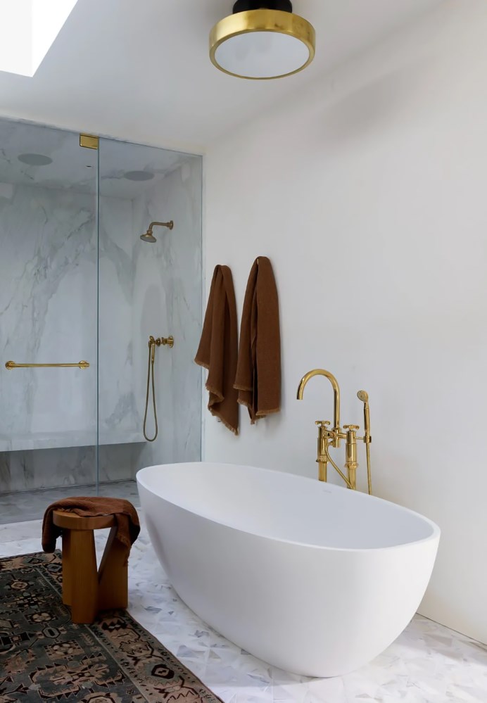
Green Street Residence by Katie Martinez Design - Image Credit: Paul Dyer
This year's Color of the Year introduces a quieter approach to palette development. The emphasis shifts toward how materials interact rather than how a single hue defines a space. This encourages designers to build palettes through texture, undertone, and the rhythm of materials across a room. Natural surfaces guide that process, offering warmth and visual interest without overwhelming the foundation. The approach aligns with biophilic thinking, where subtle transitions and authentic finishes create calm, grounded environments. In practice, the palette becomes less about color statement and more about cohesion, comfort, and intentional layering.
--
![]() Swatchbox is a premier sample fulfillment service for building product manufacturers. With proprietary software designed by insiders of the design community, Swatchbox helps manufacturers improve product sales and brand affinity by delivering material samples to the design community with speed, intelligence, and style. Learn more and join Swatchbox at www.swatchbox.com.
Swatchbox is a premier sample fulfillment service for building product manufacturers. With proprietary software designed by insiders of the design community, Swatchbox helps manufacturers improve product sales and brand affinity by delivering material samples to the design community with speed, intelligence, and style. Learn more and join Swatchbox at www.swatchbox.com.


Comments